Making sense of investing and portfolio performance
 Image by NeONBRAND
I recently started saving for retirement. I’ve had a TSP account from military service, but there has been no contributions, or even a rebalance in 13 years. And now is a good time to get started. Don’t get me wrong, we have been building our savings as a family, but every so often they were depleted - moved across states and had a baby (he’s 9 now!), payed off credit card debt, closed on a house, that sort of thing.
So, I opened a Roth IRA and a taxable investing account last month. Ever since, I’ve spent my evenings and workouts listening to podcasts and reading broadly about the topic. I’ve taken some key points that have guided my buys so far:
- I can’t beat the market, so low-cost ETFs are great options.
- I can invest in real estate by investing in REITs.
- Portfolios need diversified holdings, and a planned allocation for them. I plan to somewhat align with David Swensen’s recommended allocation by the end of the year.
1 You can do that in R!
Being an R user, I figured I could analyze my portfolio using R. I came across the tidyquant package, which integrates several financial analysis packages into the tidyverse framework.
library(tidyverse)
library(tidyquant)
library(patchwork)
These are my holdings and their proportional value allocations based on share closing prices on 5/13/2020. These will be used as weights for the portfolio analysis.
weights <- tribble(
  ~acct, ~symbol, ~prop,
  "combined", "BND", 0.090,
  "combined", "DLR", 0.186,
  "combined", "EPR", 0.216,
  "combined", "VNQ", 0.202,
  "combined", "VTI", 0.119,
  "combined", "VTR", 0.141,
  "combined", "VXUS", 0.046,
  "ira", "BND", 0.140,
  "ira", "DLR", 0.289,
  "ira", "VNQ", 0.314,
  "ira", "VTI", 0.185,
  "ira", "VXUS", 0.072,
  "ind", "EPR", 0.605,
  "ind", "VTR", 0.395
)
2 Returns
tidyquant accesses a multitute of web-based financial data and makes it available in tidy format.
tq_get(unique(weights$symbol),
       get = "stock.prices",
       from = "2020-05-13",
       to = "2020-05-14") %>%
knitr::kable()| symbol | date | open | high | low | close | volume | adjusted |
|---|---|---|---|---|---|---|---|
| BND | 2020-05-13 | 87.14 | 87.19 | 87.01 | 87.06 | 2628900 | 87.06 |
| DLR | 2020-05-13 | 132.70 | 136.82 | 131.25 | 133.42 | 2474700 | 133.42 |
| EPR | 2020-05-13 | 24.86 | 25.40 | 23.85 | 23.85 | 3682900 | 23.85 |
| VNQ | 2020-05-13 | 70.03 | 70.36 | 68.51 | 68.83 | 8358600 | 68.83 |
| VTI | 2020-05-13 | 143.90 | 144.31 | 140.02 | 141.45 | 5862100 | 141.45 |
| VTR | 2020-05-13 | 27.36 | 27.46 | 26.58 | 26.79 | 5042400 | 26.79 |
| VXUS | 2020-05-13 | 45.16 | 45.20 | 44.31 | 44.56 | 5100600 | 44.56 |
Here we’ll take a look at total monthly returns for the past year:
# set a start date for returns
start_date <- "2019-01-01"

# monthly returns for individual securities
returns_combined <- tq_get(unique(weights$symbol),
                           get = "stock.prices",
                           from = start_date) %>%
  group_by(symbol) %>%
  tq_transmute(adjusted, periodReturn,
               period = "monthly",
               col_rename = "Ra")

# portfolio returns
get_returns <- function(return_df, weight_df, growth = FALSE){

  df <- return_df
  x <- weight_df
  # filter weights for correct acct
  wt <- filter(weights,
               acct == x) %>%
    select(-acct)

  tq_portfolio(df,
               assets_col = symbol,
               returns_col = Ra,
               weights = wt,
               col_rename = "returns",
               wealth.index = growth)
}


port_combined <- returns_combined %>%
  get_returns("combined")

# plot returns
p_combine <- plot_returns(returns_combined, port_combined) +
  labs(subtitle = "Combined portfolios")

p_combine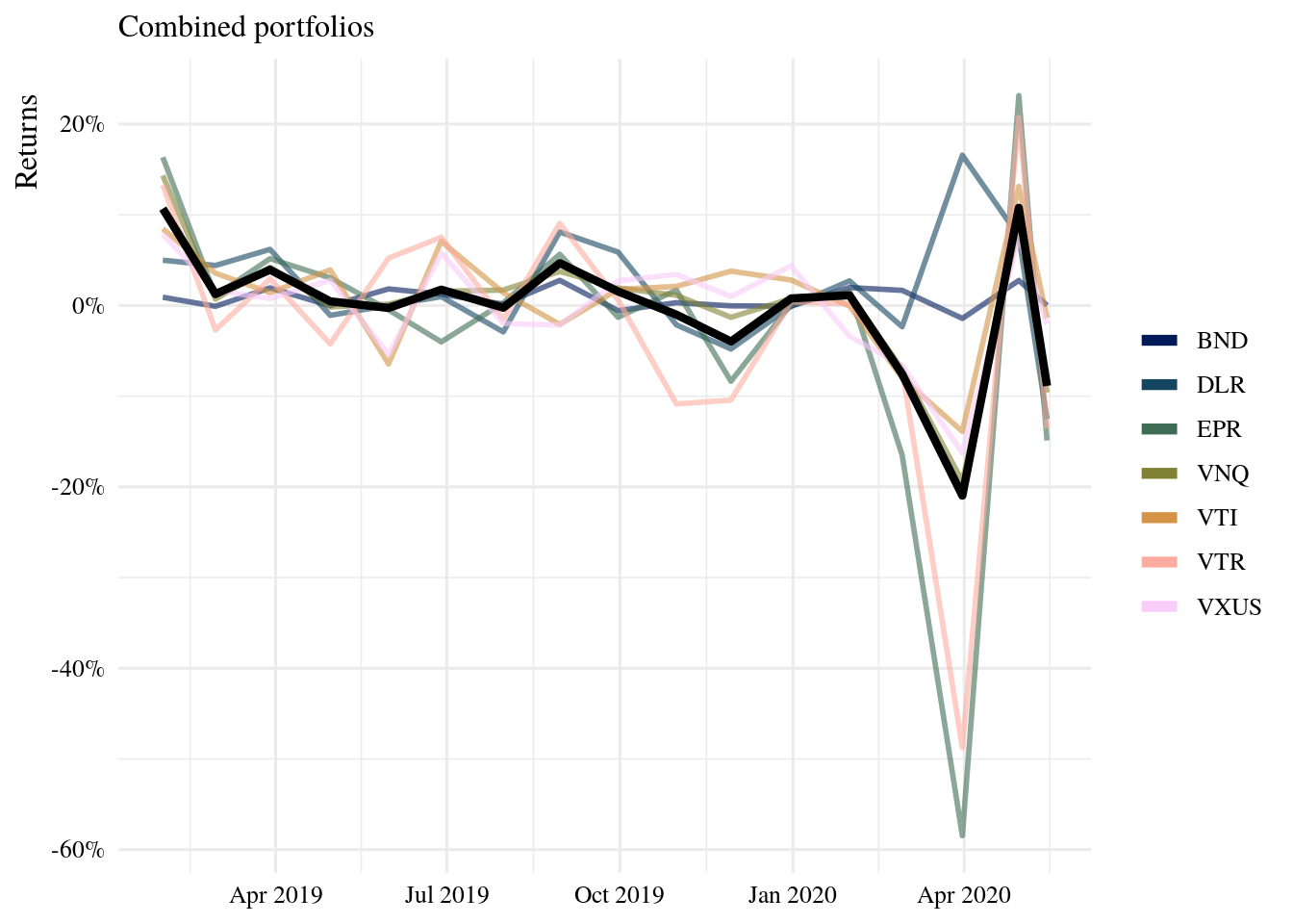
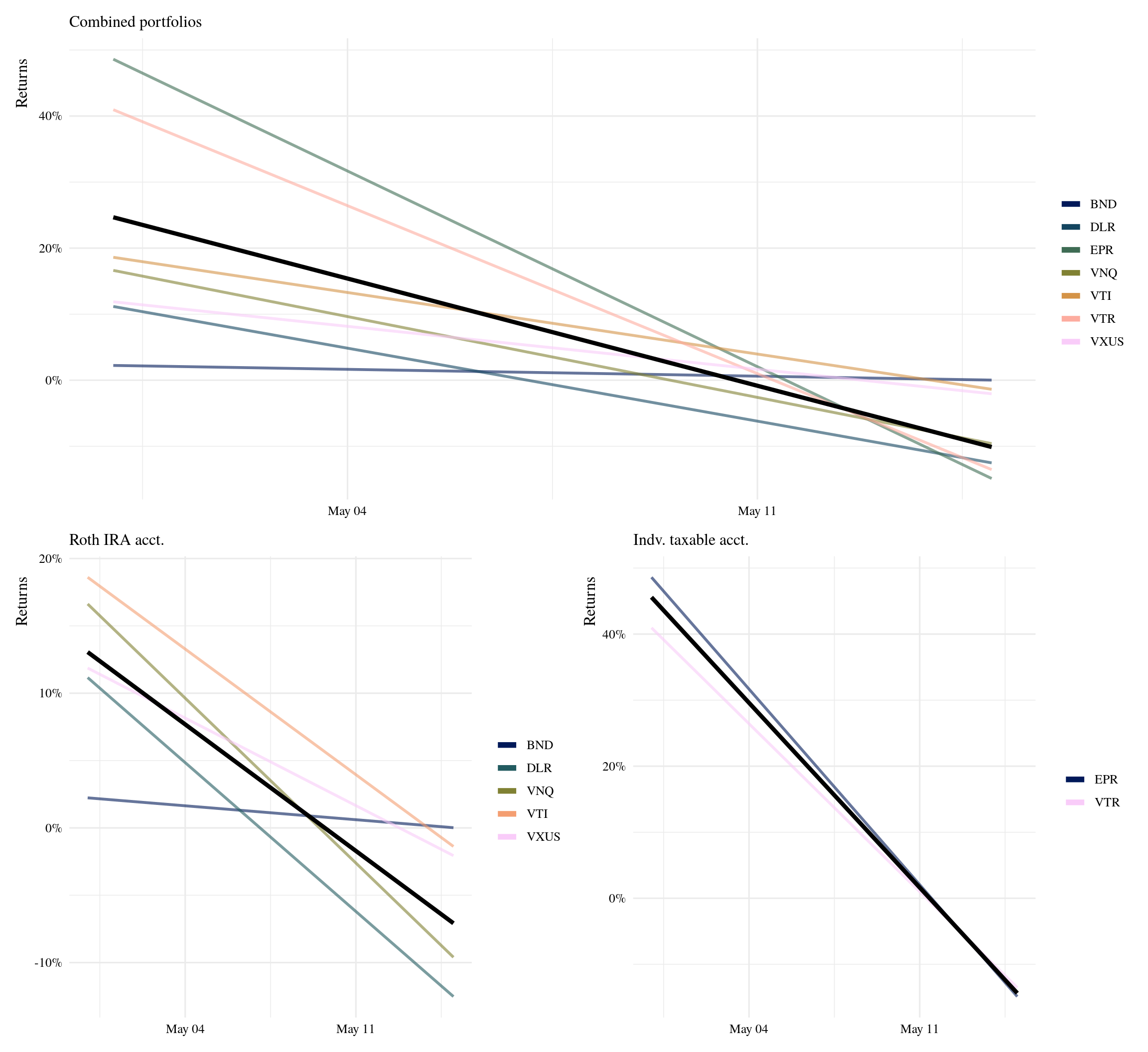
Now, let’s do this for each portfolio, and also examine the investment growth of a dollar.
port_ira <- returns_combined %>%
  filter(!symbol %in%
           c("EPR", "VTR")) %>%
  get_returns("ira")

port_ind <- returns_combined %>%
  filter(symbol %in%
           c("EPR", "VTR")) %>%
  get_returns("ind")

# track growth
growth_ira <- returns_combined %>%
  filter(!symbol %in%
           c("EPR", "VTR")) %>%
  get_returns("ira", growth = TRUE)

growth_ind <- returns_combined %>%
  filter(symbol %in%
           c("EPR", "VTR")) %>%
  get_returns("ind", growth = TRUE)

#-- plots
# I wrote some plot functions and saved
# them on a separate script
# code: https://github.com/iecastro/blogdown-site/blob/master/content/post/2020-05-15-ira-portfolio/plot-functions.R"

# returns plots
p_ira <- returns_combined %>%
  filter(!symbol %in%
           c("EPR", "VTR")) %>%
  plot_returns(port_ira) +
  labs(subtitle = "Roth IRA acct.")

p_ind <- returns_combined %>%
  filter(symbol %in%
           c("EPR", "VTR")) %>%
  plot_returns(port_ind) +
  labs(subtitle = "Indv. taxable acct.")

# growth plots
grow_ira <- plot_growth(growth_ira) +
  labs(subtitle = "Roth IRA acct. growth of $1")

grow_ind <- plot_growth(growth_ind) +
  labs(subtitle = "Indv. taxable acct. growth of $1")

# patchwork
p_combine / (p_ira +  p_ind) / (grow_ira + grow_ind)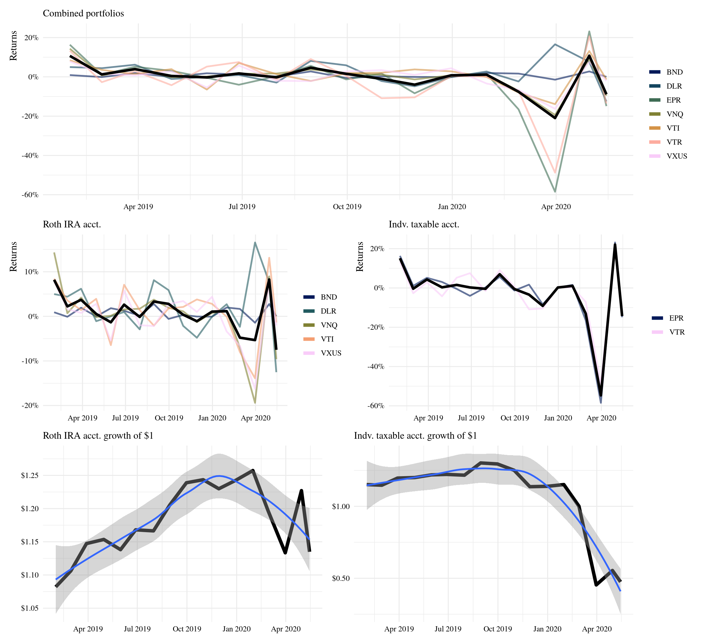
Having different types of assets helps reduce volatility. The taxable portfolio, which only holds two REITs has been the hardest hit by the current market trends. These REITs however, have historical high returns and are expected to bounce back. As for growth, no big surprise here - a dollar invested last year is worth about the same today.
3 Previous 10-year growth
💰 💰 💰
Now let’s look at historical returns for the past ten years. For this we just need to update the start_date parameter and re-run the analysis.
start_date <- "2010-01-01"These portfolios would’ve increased 3x in value over ten years. Keeping holdings and allocations the same, a one-time deposit of $10K into the IRA account back in 2010, would now be worth $30K.
If $10K had been deposited into each account, the combined worth today would be $40K; but also consider the combined worth back in December would have been $60K. Volatility.
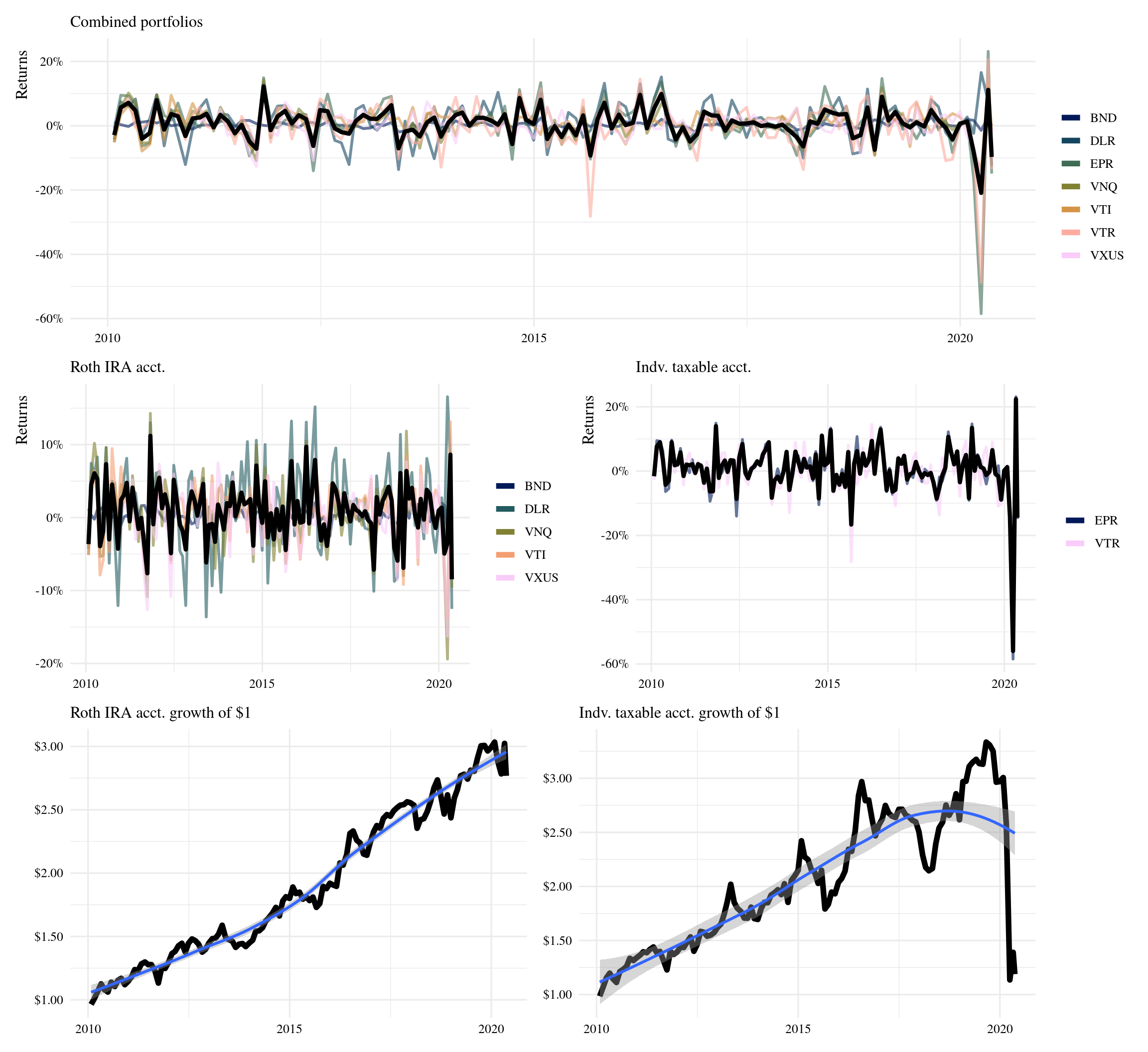
Total returns account for dividend distributions, but it does not account for dividens re-invested. Reinvesting dividends adds to your position, by owning more shares, above any additional capital. Historically, DLR has consistently increased their payouts over time. VTI has increased as well, in general; but it has a clear pattern of peaks-and-valleys.
# instead of sourcing this function
# you can download the dev version of tidyquant
source("https://raw.githubusercontent.com/business-science/tidyquant/master/R/tq_get.R")

# plot dividends timeseries
stocks <- unique(weights$symbol)

dividends <- tq_get(stocks,
                    get = "dividends",
                    from = start_date) %>%
  mutate(acct = ifelse(
    symbol %in% c("EPR", "VTR"),
    "Taxable", "Roth IRA"
  ))

dividends %>%
  ggplot(aes(date, value)) +
  geom_line(aes(group = symbol),
            size = 1, color = "#f5ed93") +
  geom_line(data = . %>%
              filter(symbol %in% c("VTI", "DLR")),
            aes(date, value, color = symbol)) +
  scale_x_date(breaks = scales::pretty_breaks(12)) +
  scale_y_continuous(labels = scales::dollar) +
  scale_color_manual(values =
                       c("DLR" = "#003F4C",
                         "VTI" = "#601200")) +
  facet_wrap(~acct) +
  labs(x = NULL, color = NULL,
       y = "Dividends payout (per share)") +
  theme(panel.grid.minor = element_blank())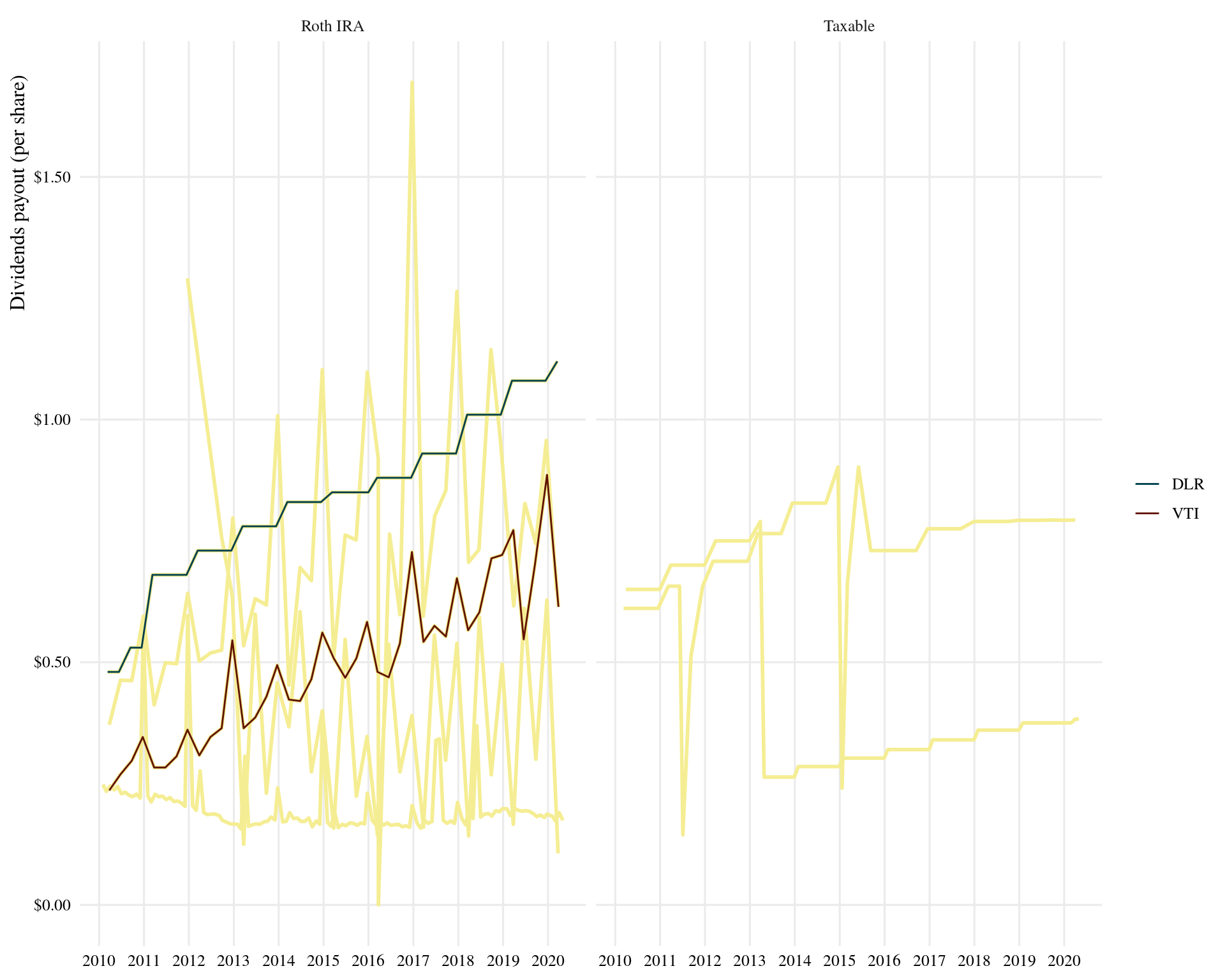
Of course, I just started this journey last month - so I’m currently seeing losses.
However, it makes more sense to look at daily returns for such a short period of time.
start_date <- "2020-04-01"

# daily returns
returns_combined <- tq_get(unique(weights$symbol),
                           get = "stock.prices",
                           from = start_date) %>%
  group_by(symbol) %>%
  tq_transmute(adjusted, periodReturn,
               period = "daily",  #<<
               col_rename = "Ra")

source("run-performance.R")

# for later comparison
asis_combined <-  plot_returns(returns_combined, port_combined) +
  labs(subtitle = "Performance of current portfolio allocations") +
  geom_hline(yintercept = -.05, lty = "dashed") +
  geom_hline(yintercept = .05, lty = "dashed")

p_combine / (p_ira +  p_ind)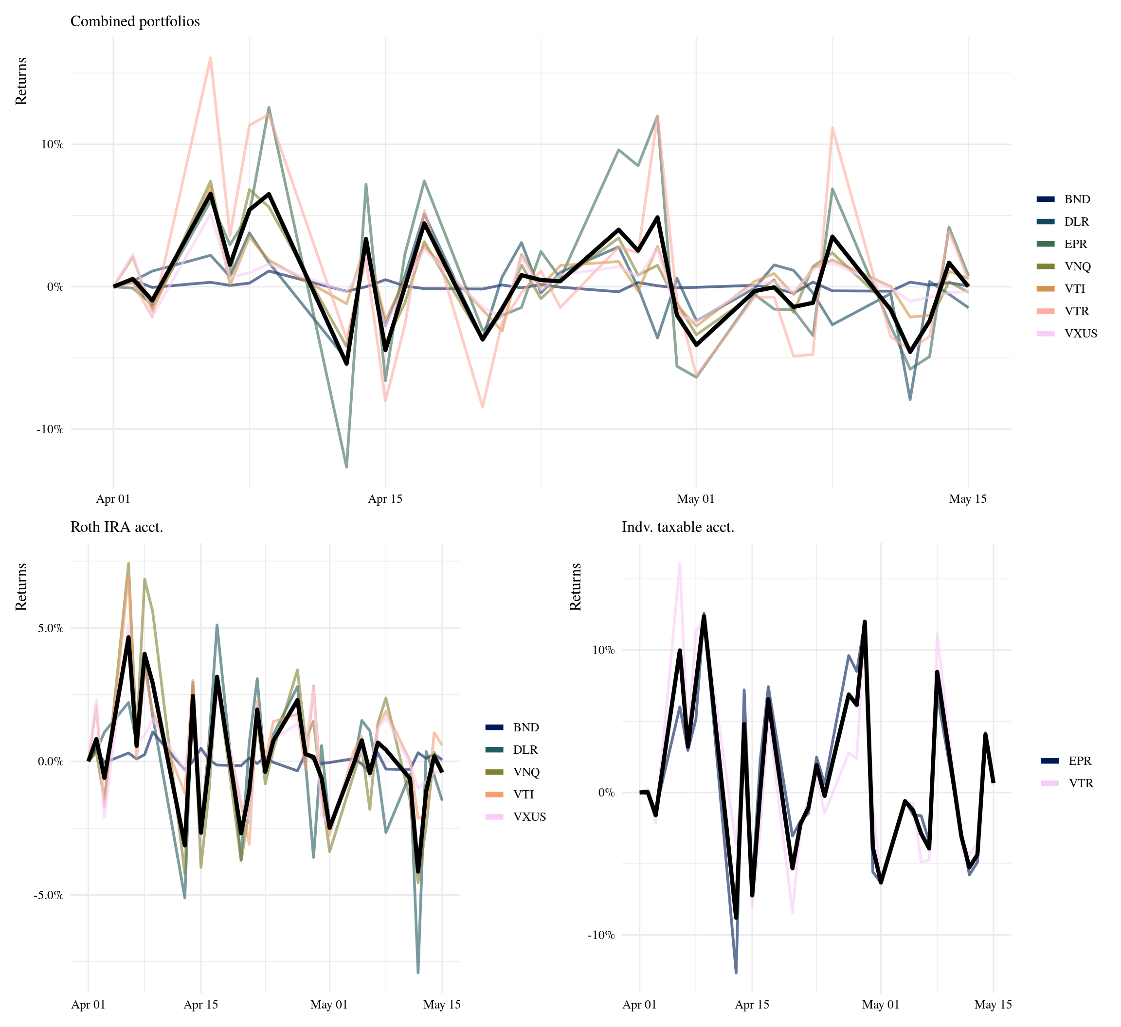
4 Allocations
By assigning asset class and sector categories to my current holdings, I can get an overview of my current allocations beyond individual securities.
allocations <- weights %>%
  filter(acct != "combined") %>%
  mutate(acct = ifelse(acct == "ind",
                       "Taxable", "Roth IRA"),
         asset_class = case_when(
           symbol %in% c("VTR", "EPR", "DLR") ~ "Equity REIT",
           symbol %in% c("VTI",  "VXUS", "VNQ") ~ "Stock ETF",
           symbol == "BND" ~ "Bond ETF"
         ),
         sector = case_when(
           symbol == "VTR" ~ "Healthcare",
           symbol == "EPR" ~ "Experiential",
           symbol == "BND" ~ "US Bond market",
           symbol == "VTI" ~ "US Total market",
           symbol == "VXUS" ~ "Int'l market",
           symbol == "DLR" ~ "Data Center",
           symbol == "VNQ" ~ "Real Estate"
         ))

# donut chart ref:
# https://www.datanovia.com/en/blog/how-to-create-a-pie-chart-in-r-using-ggplot2/
allocations %>%
  group_by(acct) %>%
  arrange(desc(asset_class)) %>%
  mutate(lab.ypos = cumsum(prop) - 0.5*prop) %>%
  ggplot(aes(x = 2, y = prop,
             fill = asset_class)) +
  geom_bar(width = 1,
           stat = "identity", color = "white") +
  coord_polar(theta = "y", start = 0) +
  geom_text(aes(y = lab.ypos,
                label = scales::percent(prop)),
            color = "white") +
  ggrepel::geom_text_repel(aes(y = lab.ypos,
                               label = sector),
                           nudge_x = 1, vjust = 1,
                           direction = "both",
                           min.segment.length = 2,
                           segment.size  = 0.2,
                           segment.colour = "Gray60") +
  gameofthrones::scale_fill_got_d() +
  theme_void(base_family = "serif",
             base_size = 14) +
  theme(legend.position = "bottom",
        legend.title = element_blank()) +
  xlim(0.5, 2.5) +
  facet_wrap(~acct)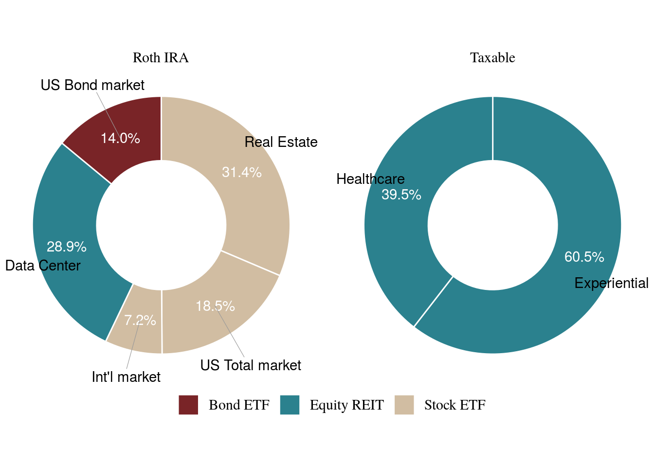
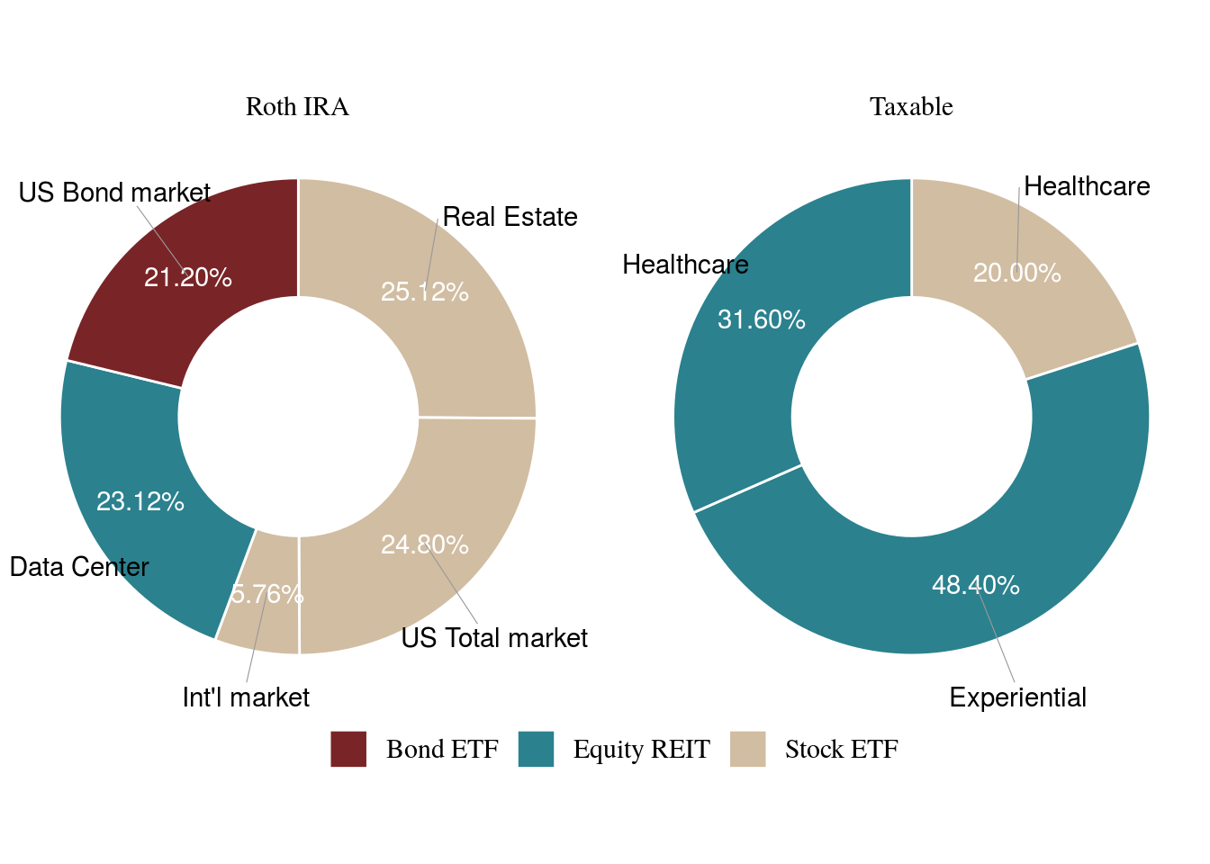
Currently, I’m heavy on real estate, but as the year progresses this should start to rebalance. Let’s say I have $500 to buy shares next month; as a priority, I’m interested in purchasing VHT, and increasing my position in BND and VTI. In this example, I’ll multiply my current allocations by $1,000 for simplicity. But you should use the actual values of your holdings - and add to that.
# rebalance portfolio
rebalance <- allocations %>%
  add_row(acct = "Taxable", symbol = "VHT", prop = 0,
          asset_class = "Stock ETF", sector = "Healthcare") %>%
  mutate(current = prop*1000,
         new = case_when(
           symbol == "BND" ~ current + 125,
           symbol == "VTI" ~ current + 125,
           symbol == "VHT" ~ current + 250,
           TRUE ~ current + 0
         )) %>%
  group_by(acct) %>%
  mutate(rebalance = new / sum(new)) %>%
  ungroup()

rebalance %>%
knitr::kable()| acct | symbol | prop | asset_class | sector | current | new | rebalance |
|---|---|---|---|---|---|---|---|
| Roth IRA | BND | 0.140 | Bond ETF | US Bond market | 140 | 265 | 0.2120 |
| Roth IRA | DLR | 0.289 | Equity REIT | Data Center | 289 | 289 | 0.2312 |
| Roth IRA | VNQ | 0.314 | Stock ETF | Real Estate | 314 | 314 | 0.2512 |
| Roth IRA | VTI | 0.185 | Stock ETF | US Total market | 185 | 310 | 0.2480 |
| Roth IRA | VXUS | 0.072 | Stock ETF | Int’l market | 72 | 72 | 0.0576 |
| Taxable | EPR | 0.605 | Equity REIT | Experiential | 605 | 605 | 0.4840 |
| Taxable | VTR | 0.395 | Equity REIT | Healthcare | 395 | 395 | 0.3160 |
| Taxable | VHT | 0.000 | Stock ETF | Healthcare | 0 | 250 | 0.2000 |
This helps me think through how my allocations would look like by the end of the next quarter.
5 Explore securities before buying
VHT is a healthcare ETF that took a dip during March, but overall has been growing steadily. It is currently trending upwards again, and would’ve likely been a better purchase if executed back in April.
The chart below is a ‘candlestick’ chart, widely used in finance to track the price movement of securities. It is similar to a boxplot, but instead of plotting quartiles, it plots daily prices (High, Open, Low, Close).
vht <- tq_get("VHT",
              get = "stock.prices",
              from = "2015-01-01")

p_vht <- ggplot(vht,
                aes(x = date, y = close)) +
  geom_candlestick(aes(open = open, high = high,
                       low = low, close = close)) +
  labs(y = "Closing Price", x = "",
       title = "Historical closing price of VHT",
       subtitle = "Past 5 years") +
  theme_tq() +
  scale_y_continuous(labels = scales::dollar)

end <- today() -1

zoom_vht <- p_vht +
  coord_x_date(xlim = c(end - lubridate::weeks(6), end),
                ylim = c(155, 195)) +
  # add simple moving avg trend line  - tidyquant feature
  geom_ma(ma_fun = SMA, n = 15, color = "darkblue", size = 1) +
  labs(y = NULL, title = NULL,
       subtitle = "Past 6 weeks",
       caption = "Dashed line represents Simple Moving Averages")

p_vht / zoom_vht 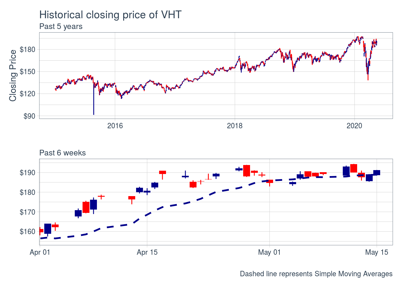
Blue candles indicate the closing price was higher than the open; red candles indicate the opposite.
Although movements can appear random, sometimes there are patterns that can be used for trading purposes based on the sequence of size and candle colors. You can read more here.
Additionally, I can easily compare VHT returns YTD to those of an S&P 500 ETF. VHT has performed very similar to VOO, while holding a broad position in the healthcare sector only.
tq_get(c("VHT", "VOO"),
       get = "stock.prices",
       from = "2020-01-01") %>%
  group_by(symbol) %>%
  tq_transmute(adjusted, periodReturn,
               period = "weekly",
               col_rename = "returns") %>%
  ggplot(aes(date, returns)) +
  geom_line(aes(color = symbol),
            size = 1) +
  theme_tq() +
  scale_color_tq(theme = "dark") +
  labs(x = NULL, y = NULL, color = NULL,
       subtitle = "YTD returns (weekly) of VHT compared to VOO (S&P 500 ETF)") +
  scale_y_continuous(labels = scales::percent)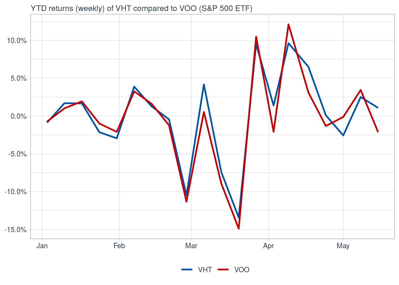
This is ☝️ an over-simplification. To make robust comparisons, we’d have to statistically compare the asset returns (VHT) to the baseline returns (VOO)
6 Compare current vs planned allocation
Now, new holdings aside, let’s rebalance my current allocations to Swensen’s allocation and see how they would’ve performed in the past six weeks.
rebalance <- allocations %>%
  mutate(acct = "combined",
         prop = case_when(
           symbol == "VTR" ~ .05,
           symbol == "EPR" ~ .05,
           symbol == "BND" ~ .30,
           symbol == "VTI" ~ .30,
           symbol == "VXUS" ~ .20,
           symbol == "DLR" ~ .05,
           symbol == "VNQ" ~ .05)
  )

rebalance %>%
knitr::kable()| acct | symbol | prop | asset_class | sector |
|---|---|---|---|---|
| combined | BND | 0.30 | Bond ETF | US Bond market |
| combined | DLR | 0.05 | Equity REIT | Data Center |
| combined | VNQ | 0.05 | Stock ETF | Real Estate |
| combined | VTI | 0.30 | Stock ETF | US Total market |
| combined | VXUS | 0.20 | Stock ETF | Int’l market |
| combined | EPR | 0.05 | Equity REIT | Experiential |
| combined | VTR | 0.05 | Equity REIT | Healthcare |
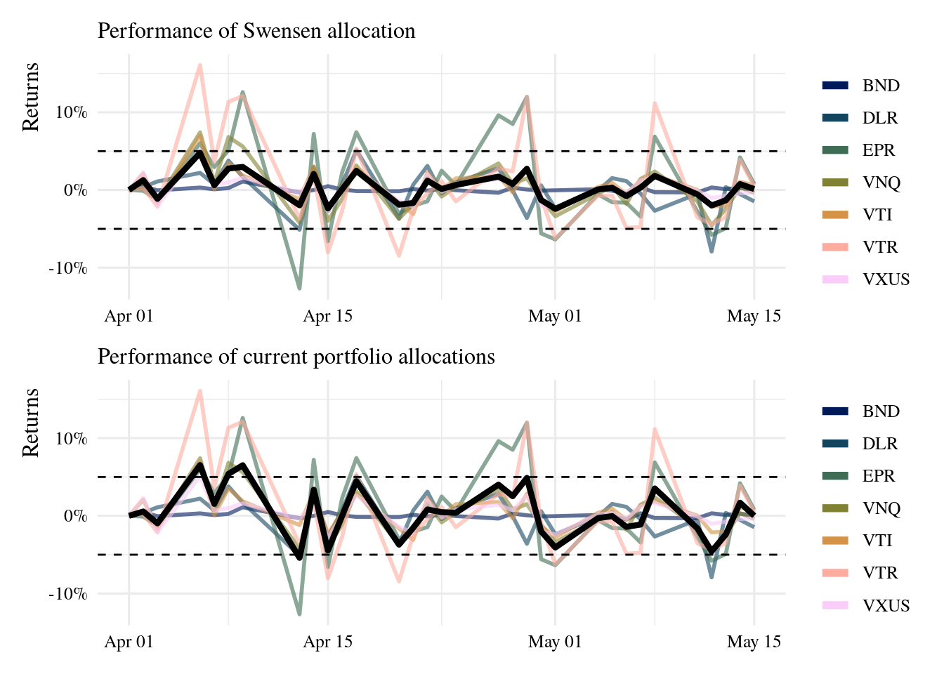
The Swensen allocation has fared a bit better day-to-day, avoiding drops like the -5% in returns seen in the current portfolio. But it also has not reached increases like the current portfolio. Overall, returns at the end of the observed period are very similar between allocations, but the volatility is quite different.
7 Conclusions
📝
- To avoid volatility, I will need to add to holdings on a consistent basis (i.e. every paycheck, or month or quarter), but also track the allocation weights compared to plan.
- Will probably also rebalance as a whole once a year.
tidyquantis a powerful package to help examine the performance of current portfolios, and historical performance of tentative purchases.- The package offers much more than presented here, with dozens of performance metrics implemented
- R is a great tool to help me track investments over time.
- I’ve also started an RStudio project to help me implement a reproducible workflow